
I was fortunate enough to snag a Nintendo Switch 2 preorder way back when the floodgates opened and the retailer websites had a collective conniption under the strain of the traffic. On June 5, my package arrived—complete with a free and unexpected bottle of Coca-Cola and a can of Pringles.
I’d like to post more of my thoughts on the device after I’ve had time with more of its library beyond Mario Kart World, but even now, it has me thinking: What do we actually want from our games—and what does it really mean for a game to look “impressive”? What’s the minimum power level that actually matters to the average player? I’ve been having a great time experiencing Mario Kart’s open world and interconnected race tracks, and I’ve also been playing through the 2018 God of War for the first time. Playing on PS5, it basically automatically incorporates the extra PS4 Pro performance options that render the game at 60fps with checkerboarded 4K. I would honestly have a difficult time telling that it was not a native PS5 game if I didn't already know. But at its core, it’s still a PS4 game, and it still looks great running on a base PS4. While God of War pushes visual fidelity with every trick in the PS4 Pro’s arsenal at the time, Mario Kart World offers a similarly engrossing experience without the same graphical firepower or ambitions. I’m having a great time with a fully last-gen title, and a brand new one launching on last-gen-ish hardware. To me, this suggests that visual design, performance balance, and setting player expectations matter much more than brute strength and raw fidelity.
We’re at a point where performance gaps between gaming hardware are shrinking—or, at the very least, becoming less relevant to how fun or memorable a game is. The newest iPhones can now run full-fat AAA games like Resident Evil Village, Assassin’s Creed Mirage, and Death Stranding with good results. And yes, Cyberpunk 2077 reportedly runs better on the Switch 2 than it ever did on a base PS4 or Xbox One.
That’s why it was disappointing—if not surprising—to hear Sony Interactive Entertainment’s CEO, Hideaki Nishino, double down on raw power as the key metric for gaming greatness. In a recent statement, he said:
“We believe PS5-level performance is required to achieve a great experience on big screens. And in this way, we have provided a unique offering for players and creators in this current console generation.”
It’s not an overtly hostile comment, but it feels like a subtle jab at Nintendo’s approach; it feels like an attempt to equate “great experience” with sheer hardware horsepower. The comment was a response to a question about whether Sony should feel worried about Nintendo’s improved hardware and 3rd-party relationships, and it feels disingenuous to literally every single console generation prior that offered “great experiences” of their own. That philosophy of power over all else is starting to show cracks. What happens when pushing for constant visual realism results in longer dev cycles, bigger budgets, smaller creative risks, and more studio closures? And what alternative paths exist? What qualifies a game to be considered 'good-looking' or 'impressive'? And does it really require PS5-level performance, as Sony's leadership suggests? If PS5-level performance is the baseline for greatness, as Sony claims, then we need to seriously ask: great for who, and at what cost? When every leap forward demands longer dev cycles, ballooning budgets, and increased risk aversion, how long can that model hold? And what happens when the most memorable experiences come not from sheer power, but from creativity within limits?
“Real Life” is a Boring Art Style
Realism in games has become a kind of arms race—and like most arms races, it’s expensive, exhausting, and inevitably reaches a point where one or all participants collapse. Insomniac’s Spider-Man 2, if we’re talking pure fidelity and detail, looks absolutely incredible. It, and other games of its graphical ilk (your Horizons, your Red Deads, your Last of Us-es, etc.) are some of the most meticulously detailed digital worlds that consumers can play around in. With current technology, characters can have peach fuzz on their faces and have incredibly lifelike facial expressions due to the gigabytes’ worth of models, textures, shaders, and motion capture data crammed into the game files. These games can often present pretty impeccable facsimiles of realistic people and environments when optimized for hardware with enough beef to play around with. That’s great, and all—but should any of these really even be in the conversation about the “best-looking” games ever? Yes, they’re pretty unmatched in replicating the aesthetic of live-action cinema. But I’d argue that “Real Life” is not an actual art style, and that the ceaseless pursuit of detail and realism in games above other priorities is a pointless and expensive bubble that could be about to burst (if it hasn’t already, with the numerous closures and layoffs).
Many of the supporting characters in the Insomniac Spider-Mans suffer a bit from what I’m gonna call “MCU Suit Syndrome”. In their quest to anchor super suits in ‘believable’ realism, they often land in a strange uncanny valley—not quite practical armor, not quite colorful comic-book flair. I’m not saying that the Marvel Cinematic Universe suits are bad. Many of them look great in context—at the very least, they are about as good of a job as you could possibly do when translating comic book costumes into real life suits for actors to wear. I think the root of the problem is that they have to be made in real life at all. In the Spider-Man games, characters like Shocker and Scorpion end up looking a bit silly because the intended overall art style is just “real life”, and characters like these are larger than life. They were originally designed to be drawn in comic book panels, not trudging around a highly detailed and realistically lit simulacrum of New York. As such, the approach to making their colorful suits into a more practical body armor type of thing shoves their looks into a bizarre, uncanny middle ground. While I’m not a fan of every character design in Marvel Rivals, I think its overall visual identity is so much more cohesive and appealing than Insomniac’s chunk of the Spider-Verse. Some things are just better suited to more extreme stylization, and I think superheroes are one of those things. Art styles like those in the Spider-Verse films and Netflix’s Arcane don’t just have powerfully emotive, impactful scenes despite their unrealistic style; the impact is often heightened because of their style. There are things you can do in animation that are just not possible in live-action, and I find it such a sad waste of resources to be so driven to recreate the look of live-action instead of leveraging the strengths of animation in games to create things no one has ever seen before. Digital worlds have to be built from basically scratch no matter what you’re trying to make; movies are easier to set in the modern world because you can just go to actual locations and start filming there. With a game, you have to build it from the ground up whether your setting is a space palace in a nebula or a dingy Chicago ally; it’s roughly equal amounts of work, and I find it such a waste of potential to put all of that work into just recreating the real world as best you can.
The AAA Games bubble appears to finally be bursting. Details do not come for free. Something in the process of making large-scale games has to change.
Games don’t need to recreate OUR world to be immersive. A super-stylized and cartoony game can be just as immersive in its own right. I doubt anyone would call The Legend of Zelda: Breath of Wild or its sequel “realistic”, but they are undeniably incredibly immersive for many people. Their painterly, saturated art style is not trying to emulate real life, and it would look about a million times worse if it was trying to do that on the Switch’s potato architecture. Their physics systems are incredible and highly interactive, especially in Tear of the Kingdom. But while they may replicate certain aspects of real-world physics, they use those aspects to present a simplified and game-friendly set of logical rules. Both the look of the world and the way you interact with it are stylized and abstracted, and I would say the games are all the better for it.
Strict realism is much easier to recreate in still images than it is in an animated, interactive context. In a video game, there are numerous ways to interact with the world, many that the developers did not intend and could not have foreseen. The more realistic a game looks and behaves, the more jarring it is when something happens that breaks the illusion. Link and Mario both look perfectly natural being catapulted into the air in stylized ways because they exist in highly stylized worlds. Aloy launching herself 15 feet in the air with a grappling hook in Horizon: Forbidden West looks more uncanny because in most other instances, she moves and carries herself like a realistic human with the accompanying weight and physics and exists in a world that’s trying its darndest to look photoreal; animations that defy realistic physics like said grapple launch can often clash with the rest of the realism the game works so hard to maintain. Games often need to break logical rules in the interest of fun and approachability (which I would say is a good thing, and the sensible choice in most contexts), but I would argue that this aggressive pursuit of realism just makes those departures from reality harder to swallow and breaks immersion in the world. The same is true of glitches and bugs; it seems that the “gamier” the game is, the less triggering it is for our brains when we see an NPC floating a foot off the ground or clipping through geometry. The more it’s trying to look like a live-action movie, the more those little hiccups damage your immersion.
I’m not saying there’s no place for realism in games at all. If we’re ever gonna get to true Star Trek-esque holodecks with visuals indistinguishable from reality, I guess these are all necessary middle steps. And when used in a fitting context, I think realistic graphics can be great. A game like the Dead Space remake, for example, uses its hyper-detailed gore and industrial grime to enhance its horror—realism becomes a tool in service of its atmosphere, not the end goal in itself. As much as I liked the remake, I think I actually enjoyed playing through Dead Space 2 on my Steam Deck more. The underlying game design just clicked with me more, and I found its larger space station environment to be more engrossing. Another anecdotal knock against the notion that PS5-caliber experiences are the gold standard. As games are now, I just don’t think the price-to-payoff ratio of this religious pursuit of detail and fidelity is worth it. AAA games are ballooning in almost every regard; more hours of content, more detail, more storage space eaten up, exponentially more money to create. Things can’t keep increasing linearly forever. That balloon is bound to pop at some point; it may have done so already, and we’re just waiting for the tattered rubber to hit the floor.
So what’s the alternative? What exactly am I advocating for? Basically, I want more experimentation and daring expression in video game art styles. Indie teams are already doing this, but I’d like to see more of the big publishers take some lessons and try something different. I want to do my part to help dispel the stigma that games with stylized or simple graphics are inherently more kiddie or otherwise lesser than ones with hyper-detailed, photorealistic looks. Below, I will list some examples and describe what did or didn’t work for me. There will be a few examples of things I deem as cautionary tales, but I mostly want to showcase just a small sampling of the positive potential of embracing unique art styles. I’m not saying “go copy these games’ art styles”; I just want to show some varied examples of how stylized art of different flavors, when executed well, can enhance a game’s appeal and add a timeless quality to their identity.
Examples and Case Studies: Games with Highly Stylized Visual Languages
GOOD: Astro Bot - I feel this is a very good example of raw system power being leveraged to create a unique and cohesive style. The game is a technical showcase for the PS5, but one that does not sacrifice style for realism. Nearly everything has impeccable, highly-detailed shapes and textures, but with a shiny, larger-than-life coat of “pop” poured all over everything. The technical wizardry in the mouse level was mind blowing to me; you can shrink and run around down like Ant-Man, and the level of detail in the now-massive world is still crisp.
GOOD: The Legend of Zelda: The Wind Waker - Y’all know the story of this one, I’m sure. I’m glad that retrospection has been kind to this game and the general consensus seems to have swung towards appreciating this hyper-stylized gem. Given the apparent bait-and-switch of how different the actual game looked vs. what the Spaceworld 2000 Zelda tech demo put in fans’ minds, Zelda fans of the era were somewhat justified in being caught off guard by this chibi, cartoony Link. But the knee-jerk reaction to write off the entire game as childish and unworthy of the franchise was clearly a mistake. It wasn’t what fans expected at the time, but this game’s style has aged incredibly well, and those who gave it a chance were rewarded with an extremely solid Zelda title.

BAD: The Legend of Zelda: Twilight Princess - I’m just gonna say it: this game is fucking ugly. A vocal subgroup of fans finally got the gritty, serious Zelda game they were pining for, and, as far as visuals go, it was pretty gross. In comparison to Wind Waker, Twilight Princess has aged like a banana in a hot car. The color palette was quite representative of the era in the worst way, with washed out colors and a general brownness to everything. And, personally, I just find the majority of the NPCs incredibly ugly and unappealing. Part of the issue was that the art style was poorly served by the underpowered consoles it was built for, but even the Wii U’s HD version is still pretty ugly; aside from the better resolution, I often struggle to spot the differences. I’m glad that subsequent entries in the franchise have veered more towards vibrant, painterly colors and impressionistic texturing. I think Tears of the Kingdom in particular is an excellent example of an art style that can cover the full spectrum of moods: there are many bright, beautiful areas, as well as a lot of very sinister, moody vibes. You don’t have to forever trap the art style in an overcast, sepia hell to portray a serious and dangerous vibe.
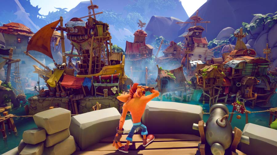
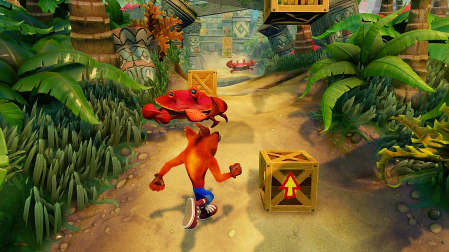
GOOD: Crash Bandicoot 4 - Toys for Bob’s approach to redefining the look of the aging Crash series deftly walked the line between reinvention and homage, with fantastic color balancing and the perfect amount of cartoony stylization. Their work on the Spyro Reignited Trilogy was excellent, and I’m so glad they carried those lessons on to their next project. Several recent releases have attempted to copy the aesthetic to various degrees of success (e.g. Kao the Kangaroo, Nikoderiko: The Magical World), but I don’t fault anyone for trying to replicate such a clean and appealing look. It’s a great style and I would love to see it continue forward into the franchise’s future.
MEH: Crash Bandicoot: The N. Sane Trilogy - Crash 4 was the perfect counterexample to show how inconsistent and aesthetically lacking Vicarious Visions’ remake of the original trilogy really was. This version could be described as having “more” graphics, but were they actually better than the original? That’s debatable. It’s a bit difficult to articulate why at times, but I see it as a pretty mixed bag: how good the character models end up looking is highly dependent on the engine's lighting, which can be pretty inconsistent from area to area. It often feels as though the devs were relying more on the shortcuts built into the engine rather than creating bespoke effects that fit Crash’s cartoony nature. Examples can be found in the sometimes uncanny water and particle effects; for the most part, they behave and render like semi-realistic assets dropped into a game that otherwise aims for a highly exaggerated, slapstick tone. The N. Sane Trilogy sometimes mistakes surface fidelity for improvement, adding more geometry and lighting detail without rethinking how those additions impact the game’s tone and personality. It’s not unplayable or ugly by any means—it’s just strangely hollow compared to what came before, and especially when stacked against the visually confident and fully cartoon-committed Crash 4.
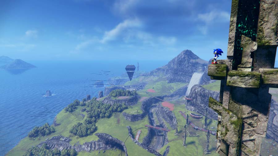
BAD: Sonic Frontiers - Fucking ew. No thank you. This game was one of the main catalysts for me thinking about how big publishers seem allergic to fully committing to stylized visuals these days. I was mildly interested in the gameplay from trailers, but the visuals kept me at arm’s length for a long time. Eventually I gave it a shot, and to be fair, it’s easier to stomach when you’re actively playing. When your focus is on movement and action, not just taking in how things look, it's much less jarring than I anticipated.
But still… I hate the look of this game. It’s that uncomfortable clash of aesthetics where this cartoon blue hedgehog is running through realistic grass, around overly-detailed stone ruins, and battling generic, overdesigned sci-fantasy robots. It gives off “Mario in Unreal Engine” vibes in the worst way: the kind of fan project that goes viral for looking impressive on a technical level, but feels entirely wrong tonally. Sonic, from day one, has lived in worlds that were colorful, surreal, and expressive. His early games were defined by bright checkerboard hills, giant pinball machines, sharply-pointed palm trees, and colorful robot bees and caterpillars with silly grins. Frontiers instead gives us washed-out earth tones, synthetic robot worms, and moodless open fields. I’m not against franchises evolving, but this specific direction feels like a betrayal of what Sonic’s visual identity was always meant to be. Not everything needs to look like it was built in a forest-themed asset pack.

GOOD: Luigi’s Mansion 3 - This was the other game that got me thinking about this subject early on. On paper, Luigi’s Mansion 3 takes place in a pretty “realistic” environment: a haunted hotel. But instead of chasing photorealism, it bends the world around the Mario aesthetic in smart, playful ways. Everything from the architecture to the lighting feels tastefully wonky, exaggerated, theatrical, and designed. It comes together like a spooky dollhouse that somehow feels lived-in, yet specifically suited for cartoon hijinks. It’s easily one of the best-looking games on the original Switch, and honestly, one of the most polished Nintendo games visually period. Next Level Games didn’t just flex their technical muscles, they poured love into every single animation, every particle of ghostly goo, and every exaggerated gesture Luigi makes. What makes it work is that the style and tone are in perfect sync. The hotel may have fairly realistic lighting and detailed textures, but it all serves the cartoon atmosphere. It feels like a Mario world filtered through a haunted funhouse lens, not a CG animation team trying to show off how well they can render reflective marble (even though the marble floors in the penthouse do look pretty damn good).
In contrast to games like Sonic Frontiers, which drop stylized characters into overly serious worlds, Luigi’s Mansion 3 shows how you can push visual fidelity without losing your soul. It’s expressive, cohesive, and true to the weird little plumber franchise it came from.
There’s also something quietly fascinating about where Luigi’s Mansion 3 takes place. While most Mario games show us the grand, whimsical landmarks of that universe—the castles, the kingdoms, the galaxy-spanning odysseys—this game feels like a peek behind the curtain. Like we’re seeing the mundane, everyday side of the Mario world. It’s still stylized and strange, but it feels like a functioning place: with hotel lobbies, restrooms, boiler rooms, and staff lounges that exist within the same cartoon logic as the characters. There’s a very strong sense of worldbuilding here that's presented through pure art direction and decoration of the space. It makes the world feel lived-in, without ever breaking the illusion.
Side Rant: Why don’t more video games in general have toilets? Are Super Mario Sunshine and the Luigi’s Mansion series the only Mario-universe games that let you fully explore regular bathrooms as a regular-sized person? I don’t mean being really tiny and driving around a comparatively giant bathroom, and I don’t mean using toilet theming for gross-out humor like that degenerate Wario is prone to do. Potty time is just a regular part of life that shouldn’t be shamed, so why don’t we see more games represent bathrooms? Does Peach’s Castle even have a place to poop? You could go into pretty much every room of the thing in Super Mario 64, and not a single one was a bathroom. I’m honestly just asking here. These are important questions.
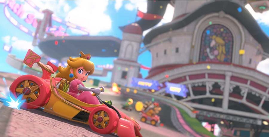
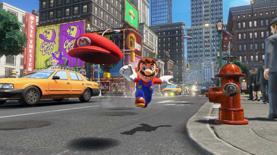
INTERESTING: Mario Kart 8 Deluxe / Mario Kart World - The base Mario Kart 8 looked fantastic on the underpowered Wii U, and the Deluxe version on the original Switch kept all of that intact while marginally improving some aspects. The game as a whole is a great lesson in working within the strengths and limitations of the hardware. The courses—when viewed at their intended proximity and speed—all look excellent. The character models—while a bit rough up close—mostly do their jobs really well.
But things started to get a little weird when the Booster Course Pass DLC was announced. This paid expansion doubled the number of tracks in the game, released in waves over a period of around 2 years. More tracks is always a good thing, and I had a lot of fun playing them and anticipating what the next waves might include. The only caveat was that every single one of these tracks was derived from the assets used in Mario Kart Tour in some way. Mario Kart Tour is a mobile game with a much simpler, flatter art style than the console Mario Kart releases. While the Booster Course Pass versions of these tracks each add noticeable refinements and increased detail over their mobile counterparts, there’s simply no getting around the clash in art style. The more realistic textures from the base game tend to give way to flat, solid colors, and the terrain is generally more abstract, flat, and jagged. There are a few outliers—courses like Waluigi Stadium and Merry Mountain, for instance, fit right in amongst the base game’s tracks. But others, like Toad’s Circuit and Mushroom Ridge, are completely incongruent with the styling of the base game’s grassy tracks. This is not a knock against the Tour aesthetic itself—the style is still very appealing in its own right. It’s the disconnect from the style of Mario Kart 8 that bothers some people. The contrast is pretty glaring, especially if you are jumping around and selecting tracks from all over the game.
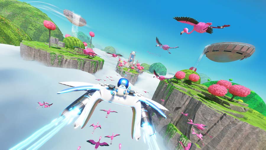
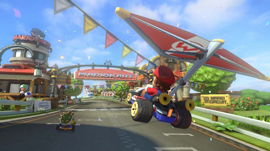
Moving on to 8 Deluxe’s next-gen successor, Mario Kart World is actually a much bigger visual upgrade than you might assume at a glance. It mostly refines the approach of base Mario Kart 8, with moderately detailed textures and exaggerated shape language. I think the fact that people were slow to notice the improvements speaks volumes about how good Mario Kart 8 always looked, but there is indeed a noticeable increase in the fidelity of the characters, courses, and lighting in World when compared to the previous entry. Some people may have expected a more drastic and comprehensive visual overhaul, considering the fact that World is a launch title designed to sell brand new hardware. However, I would argue that this iterative approach to refining what was already there was a very smart choice. Instead of solely opting for a huge increase to fidelity and detail across the board, the increased horsepower of the system was smartly applied to expanding the gameplay. We now have double the racer count—with 24 characters per race—and a large open world with dynamic weather that streams seamlessly. The increased player count alone is a game changer, especially for online play. And the open-world design makes entirely new modes like Knockout Tour possible, where racers dash from one end of the world to the other in one seamless race. And it’s still an excellent looking game overall, with a beautiful and cohesive world to explore. Some may have expected the flagship launch title for the Switch 2 to lean harder into showing off the power of the new hybrid in a more obvious way. While it’s harder to advertise and visualize them than strict graphical upgrades, the improvements under the hood are actually really effective. I’d rather that increased power be leveraged to make the underlying game more interactive than simply make it look better. Having spent hours with Mario Kart World since launch, I’ve come to appreciate just how smartly Nintendo handled the visual and technical upgrades.
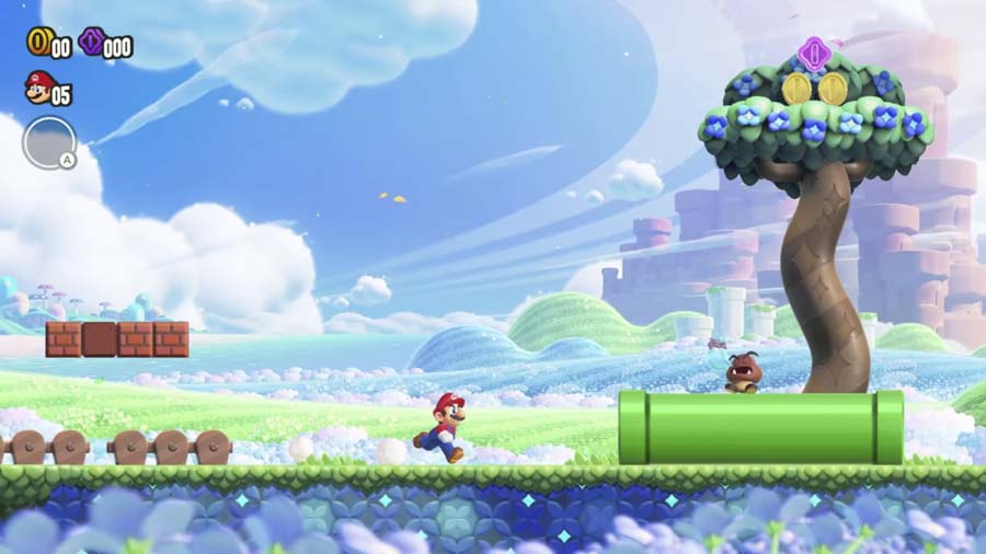
GOOD: Super Mario Bros. Wonder - It seems Nintendo took the jabs at the blandness of the New Super Mario Bros. games personally, because they really went above and beyond here. The team that made Wonder successfully reinvigorated 2D Mario with a vibrant, expressive, colorful, and endlessly creative entry. I’m glad to see that the liveliness and expressiveness of these characters seems to have carried forward into Switch 2’s Mario Kart World. I hope this is the signature look of these characters going forward.
MEH: Super Mario Odyssey - Before getting into this, I want to make one thing very clear: Super Mario Odyssey is a fantastic game that I poured dozens of hours into and very much enjoyed. The creativity on display is off the charts, and it’s a joyful, bizarre, and incredibly fun experience from beginning to end. Mechanically, it’s a masterclass in 3D platforming. The movement controls alone are fluid, expressive, and constantly surprising. But despite all that, there’s one sticking point that’s always bugged me more than I expected, and has only gotten more severe in retrospect: the art direction.
I get what they were going for. The whole premise is built around exploring wildly different kingdoms, each with its own flavor and visual logic. The idea was to make Mario feel like a true traveler, stumbling into strange, unexpected lands that don’t necessarily follow the visual language of the Mushroom Kingdom. That’s how you end up with a hyper-realistic Tyrannosaurus, a photoreal dragon, a world made of low-poly food, and of course, the famously jarring New Donk City with its realistically proportioned humans. That clash of styles isn’t a bug; it’s the point. It’s meant to evoke that sense of wonder and disorientation that comes with visiting unfamiliar places.
But even understanding that intention, it still rubs me the wrong way. I think maybe I’m just unusually sensitive to visual inconsistency, especially when it feels like the game is pushing stylization and realism into the same frame without enough glue to bind them. It creates this strange, uncanny dissonance for me, where my brain is constantly trying to reconcile art styles that feel like they belong in completely different games. It’s not even that any one kingdom looks bad on its own; for a Switch game, most of them are beautiful in their own ways and bursting with character. But put together in the same package, they start to clash in ways that feel more distracting than delightful. I had the same problem as a kid when trying to combine toys from different brands and lines—I just couldn’t stomach the mismatched proportions and visual languages. I think I gravitated toward LEGO because of the consistency. The cohesive and consistent proportions and style created a platform in which a variety of worlds and characters could easily inhabit. I think part of the problem with Odyssey is that there just weren’t enough visual outliers; maybe if one or two of the other kingdoms had more random art styles, it would have made the theme of inconsistency more… consistent, I guess? It’s still hard to articulate, but the lack of visual grounding just never fully worked for me.
I own the artbook for the game, and seeing some of the concept art made me a bit sad that we didn’t get some of these concepts portrayed with just a bit more of the standard Mario flavor. The initial concepts for the city that would eventually become New Donk City was to have humans with Mario’s proportions and style, which I think would have aged better than the realistically proportioned New Donkers we got in the final game. Once the initial shock of the contrast wears off, you’re just kind of left with the uncomfortable mismatch of aesthetics. From what I’ve seen of Mario Kart World, I feel like that’s a much better representation of what I would have wanted from Odyssey. Just look at that T. rex in MKW’s Dino Dino Jungle: it’s like a big, angry Yoshi, which is pretty unmistakably what a Mario T. rex should probably look like. The one in Odyssey is just a T. rex as the general public might expect it to look.
I know I’m in the minority here. For most players, the sheer novelty and imagination of it all outweighs any visual weirdness. But for me, that sense of cohesion matters—especially in a franchise that’s always had such a distinct visual identity. Odyssey may be a triumph in gameplay, but when it comes to aesthetics, it’s one of the rare Mario games that doesn’t quite click for me.
Side Rant: While we’re talking about T. rexes, please stop portraying your dinosaurs with shrink-wrapped, featherless skin and exposed teeth. Give them some lips, at least, and feathers when appropriate for the species. We should be past all of these fucking dinosaur lies by now.
GOOD: Penny’s Big Breakaway - I can see why this game’s visual style is not everyone’s cup of tea, but I was really enamored with it. Penny’s Big Breakaway channels a hyper-stylized, alternate-history aesthetic. In some levels, it feels like a game from a forgotten console generation between the N64 and Dreamcast, where abstract shapes, vibrant colors, and early CGI charm reign supreme. It’s part surreal digital toybox, part kinetic cartoon, with a visual language that evokes retro-futurist tech demos and the playful, scrappy oddness of early 2000s CG (like Animusic or ReBoot), all wrapped in a cohesive and deliberate art direction that’s clearly aiming more for expressive than polished. I’ve heard valid reasoning on why some people didn’t vibe with it, but I personally got a lot out of it.
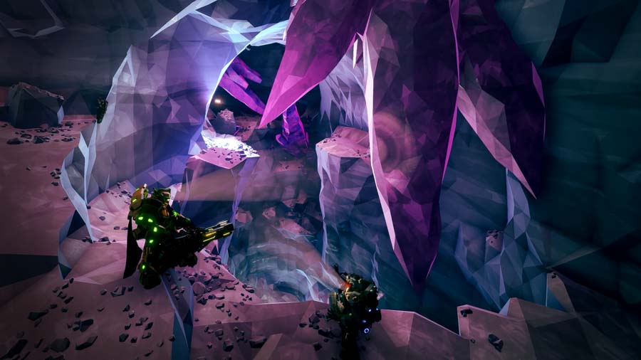
GOOD: Deep Rock Galactic - A bold, stylized low-poly art style with heavy use of angular geometry, saturated lighting, and exaggerated proportions gives DRG a gritty-yet-cartoonish industrial sci-fi vibe that’s both distinctive and functional for gameplay. The style helps reduce the game’s rendering overhead in support of its massive, destructible caves, but it also looks darn good in its own right. The game runs fantastically on a variety of devices. I’ve played hundreds of hours on PS5, Steam Deck, and my GabeCube; all of the machines handle the game like a champ.
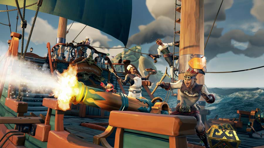
GOOD: Sea of Thieves - Rare’s ongoing, pirate-themed multiplayer game has a bright and stylized art style that blends cartoonish exaggeration with painterly textures and realistic lighting. The world is richly colored and whimsical, with exaggerated character designs, lush tropical islands, and impressively dynamic oceans that balance visual clarity with immersive detail. It captures a playful, storybook-esque take on the pirate fantasy while still feeling vast and alive.
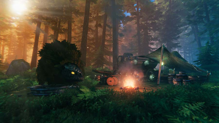
GOOD: Valheim - Valheim looks like a nostalgic throwback to early 3D gaming, with chunky, low-detail models and pixelated textures, but it’s elevated by striking modern lighting, weather systems, and a moody atmosphere that give it a unique blend of retro charm and immersive depth. It’s like taking classic RuneScape, mixing in a dash of Turok: Dinosaur Hunter, and switching RTX on.
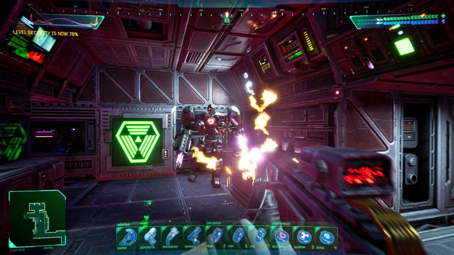
GOOD: System Shock (2023) - At a glance, you might not initially pick up on just how stylistic and retro this remake actually looks. It’s when you get in close that the uniqueness becomes apparent. The environments and character models are crisp and high-res, but the visual language remains rooted in chunky, pixelated textures, harsh lighting, and brutalist geometry. Instead of chasing photorealism, Nightdive committed to an aesthetic that feels uniquely theirs, giving the game a vibe that mixes retro, grungy, and claustrophobic. But it never feels lazy, cheap, or purely nostalgic. Nightdive understood that this style isn’t about strictly mimicking the past as much as it is about evoking a feeling. In this case, that feeling is cold, digital dread, broadcast in CRT resolution.
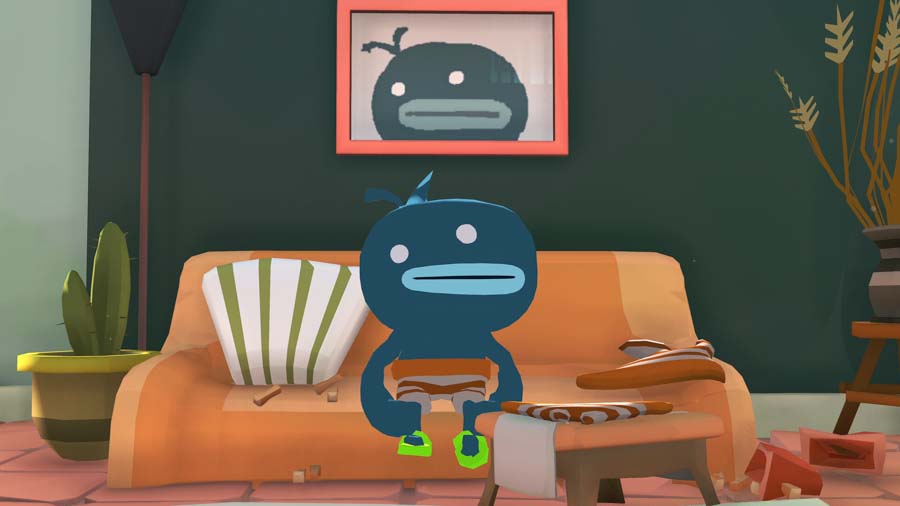
GOOD: A Short Hike / Lil Gator Game / Tiny Terry’s Turbo Trip - These three games differ in visual style, but they share a kindred spirit. All three embrace a playful, lo-fi charm and an emotionally resonant simplicity. Their worlds are compact, colorful, and intentionally “small,” reflecting themes of exploration, whimsy, and personal discovery. Each centers around imaginative kids finding joy, meaning, and beauty in the mundane. They lean into softness—both visually and narratively—in ways that feel quietly profound.
All three of them stand out for their playful tones that are grounded in moments of uncomfortable realism. They are worlds that capture a kind of shrugged acceptance that life isn’t always great, and isn't always terrible. It just is. And sometimes, that honesty hits harder than any grand message.
GOOD: Fortnite - Say what you will about the game itself or the current oversaturation of its style, but I have to give the Devil his due. The game and its multitude of skins are popular and appealing for a reason, and its aesthetic plays a big part in that. Epic successfully created a stylized, toyetic, Pixar-adjacent look in which characters from vastly different franchises can come together and not look too out of place while side-by-side. Additionally, the game is deployed across pretty much every modern platform, including all manner of mobile devices. The scalability of the art style across devices of different power levels is nothing to scoff at. I’m not honestly not going to bother getting a screenshot of this. You all know what it looks like, there are very few official screenshots available that demonstrate regular, vanilla gameplay, and I won’t capture one myself because I never plan on playing it in my life.
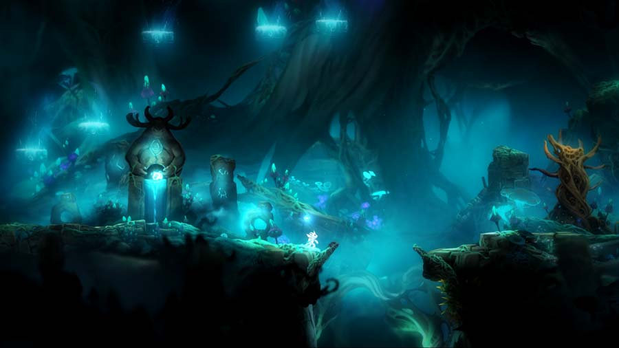
GOOD: Ori and the Blind Forest / Ori and the Will of the Wisps - These games are works of art, plain and simple. Almost any screenshot could be mistaken for a page from a beautifully illustrated, lovingly-crafted children’s book. But in motion, they’re even more breathtaking. There's something genuinely magical about the Ori games: the way their visual style, sound design, gameplay, and story all flow together in perfect harmony makes them feel more like visual poetry than typical platformers.
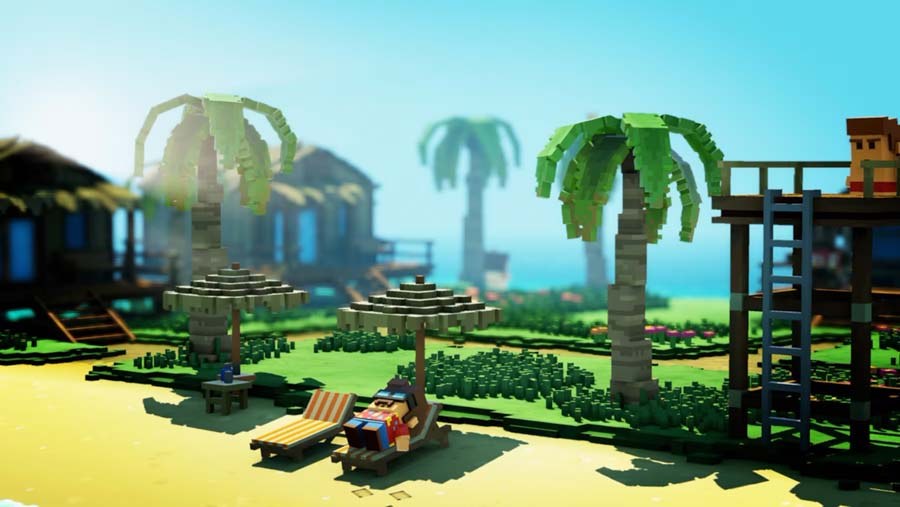
GOOD: The Touryst - Mama Mia by way of Minecraft. Shin’en’s voxel-based visuals hit a sweet spot between minimalism and detail. While the environments are blocky and stylized, they're also dense with animation, personality, and interactivity. The color-balance is exceptional, creating a bright, island-hopping aesthetic combining retro charm with sleek modern fidelity. It’s crisp and inviting, strongly evoking the pleasant warmth of tropical vacations. Shin’en’s arcane technical prowess is also on full display. Even in the game's original Switch release, The Touryst is beautiful, buttery smooth, and almost entirely devoid of load times.
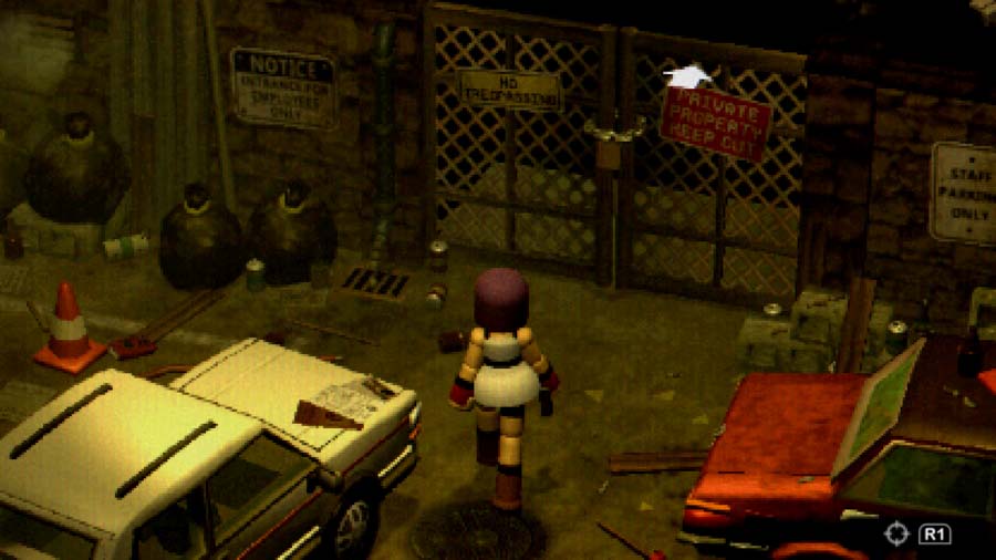
GOOD: Crow Country - This Resident Evil-inspired, low-poly horror game captures a moody and stylized aesthetic. The characters are similar to the bubbly, spheroid in-game exploration models of Final Fantasy VII, while the environments capture the RE-esque feel of pre-rendered detail. I don’t know what sorcery was employed here, but I could swear the environments were pre-rendered backdrops if it weren’t for the fact that you have full 360 degree control of the camera and can see that everything is fully modeled in 3D. It’s a really neat effect, and the solid game design underneath it all makes the whole package a very enjoyable experience from start to finish.

GOOD: Dave the Diver - A mix of 16-bit style 2D sprites and low poly, pixelated environments. It’s remarkable how well the techniques blend together; in lesser hands, it would have been easy for this to come across as cheap, discordant, or lazy. But Mint Rocket made it come together.
MEH: Yooka-Laylee / Yooka-Replaylee - It’s almost there, but there’s something frustratingly off about both versions of this game. The visuals aren’t bad, exactly—they’re polished and colorful enough on the surface—but they feel stuck in an awkward middle ground. It has just enough of a visual identity to be recognizable, but not enough to feel fully cohesive. The original Yooka-Laylee especially suffered in places like the casino and swamp environments, where the materials felt drab and lifeless. The remake, Yooka-Replaylee, does clean things up and looks much better as a result: better color balance, crisper assets, and some visual tweaks that create more cohesion between said assets. But it still chases that vaguely “modern” look without fully committing to a strong, stylized aesthetic. I will readily admit that a lot of the appeal was probably lost on me from the get-go, since I did not grow up playing Banjo-Kazooie and I find the ever-abundant googly eyes and grunty speech sounds more annoying than charming. But still, a game should be able to stand on its own and not have to rely on nostalgia to get by. Yooka-Replayee is not yet released at the time of this article's publication, so I will reserve full judgement for when the final game is released and I can see the whole thing in context. Hopefully, these first impressions give way to something more positive.
It’s not like any of is nearly as egregious as something like Sonic Frontiers. While both versions of Yooka-Laylee occasionally evoke that same “fan project in Unreal Engine” vibe, I can at least get behind the core intent that Playtonic was seemingly going for. I think the final execution needs some polish, but it's still miles better than Sonic Frontiers. Strangely, the side-scrolling spinoff Yooka-Laylee and the Impossible Lair fares much better in this realm. The shift to a 2.5D structure seems to have forced a tighter, more stylized visual approach—and the result is a simpler, more appealing game that looks and feels more unified.
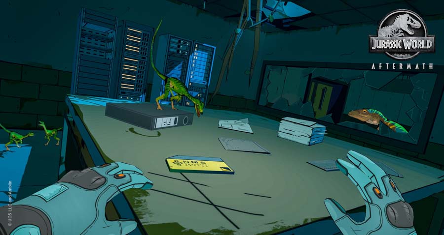
BAD: Jurassic World: Aftermath - I can see what it was aiming for with the comic book-inspired visuals, but to me, it just ends up looking cheap. When done well, I love cel-shading and hand-drawn aesthetics. But there’s a fine line between minimalism and oversimplification, and Aftermath stumbles hard into the latter. Environmental geometry is aggressively flat, textures look pixelated and muddy, and the whole thing feels like it’s held together with construction paper and hot glue. It’s got that “high school play set” vibe, where everything looks like a cardboard prop painted to vaguely resemble a real object. I get that there were hardware limitations—this was built for the Meta Quest, after all—but strong art direction can usually work around and within those limits. Here, it feels like they leaned into a “stylized” look as a shortcut rather than a statement. In theory, a Jurassic Park game with bold, comic-book visuals could’ve been something special. But this just feels like a rough sketch that made it all the way to final release. This girl just isn’t looking too clever.